Responsive Web Designing Services

Content that adapts to every screen — from a 5-inch phone to a widescreen desktop — without maintaining two separate sites.

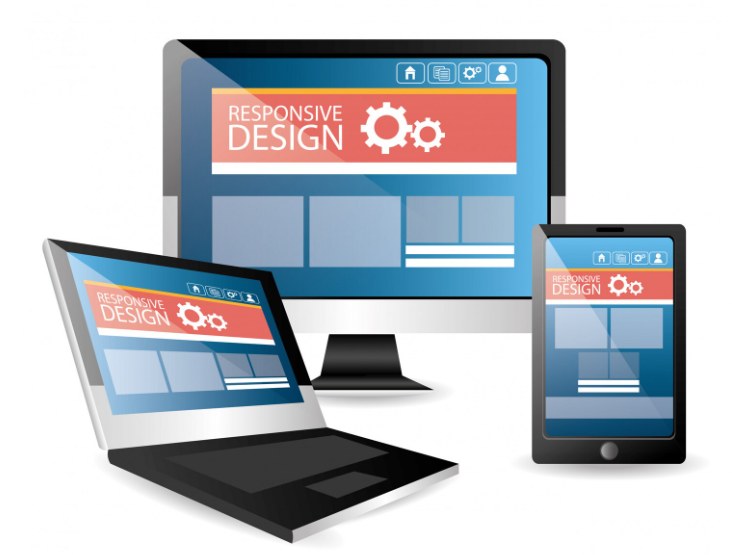
Responsive design shown across a desktop monitor, laptop and mobile phone

Responsive web design pulls together graphic design, interface design, UX design and SEO, with the focus kept on user experience rather than just the underlying software. We work across three main types: RWD (media queries that shrink the site to fit different screens), adaptive design (device-specific optimisation for iPad, iPhone, tablet) and fluid design (percentage-based widths that scale naturally).

The benefits compound: faster mobile development, lower bounce rates, higher conversion, better analytics tracking, and lower long-term maintenance costs since you're maintaining one site instead of two.

We've built responsive sites across industries — food delivery, healthcare, ticket booking — tailored to every screen size a business actually needs to reach, from Kindle to Smartphone.

What's included

What's covered under this service.

webdesignwalla.com

Custom Responsive Design

Highly responsive designs tailored to your specific needs.

webdesignwalla.com

Grid-Based Website Design

A common graphic language that helps users understand information more logically.

webdesignwalla.com

Mobile Commerce Development

Addressing the fastest-growing sector of the internet with a genuinely better mobile experience.

webdesignwalla.com

Responsive Blog Design

Design and development that responds to screen size, platform and orientation.

webdesignwalla.com

Responsive E-commerce Stores

Better user experience, improved site speed, and higher conversion rates.

webdesignwalla.com

Static-to-Responsive Conversion

Automatic adjustment to the user's device, boosting conversion rates.

When it is worth it

Responsive is the baseline. The skill is in doing it well.

Almost every new site is responsive, but quality varies enormously. Here is when a proper responsive rebuild pays off and when a lighter fix is enough.

Invest in a proper responsive build when

  • Your site looks fine on a desktop but visitors on phones pinch, zoom or leave.
  • Most of your traffic comes from mobile, which is true for many Indian businesses.
  • You maintain a separate mobile site and want a single site to look after.
  • Your Google rankings or Core Web Vitals scores are slipping.

A lighter fix may be enough when

  • Only a few pages break on small screens, so targeted fixes may do.
  • The site is otherwise sound and just needs a modern theme.
  • You are planning a full redesign soon, so combine the two pieces of work.
  • The real problem is slow loading, not layout. Start with speed optimisation.
What responsive really involves

What responsive actually means in practice.

Responsive design starts from the smallest screen and works up. We design the phone layout first, deciding what really matters on a small screen, then add space and features for tablets and desktops. Layouts use flexible grids and fluid images rather than fixed widths, with breakpoints set where the content needs them, not just at popular device sizes.

Detail separates good from merely acceptable: tap targets large enough for a thumb, readable text without zooming, forms that bring up the right keyboard, menus that are easy to reach, and images that load at the right size for the screen so mobile data is not wasted.

Google measures real-world experience through Core Web Vitals: how quickly the main content appears, how soon the page responds to a tap, and whether things jump around while loading. We build with these in mind and test on real phones, not only browser emulators.

How we work

How a responsive project runs.

  1. 1
    Step 1

    Audit

    We check your analytics for the device split and review where the current site loses mobile visitors.

  2. 2
    Step 2

    Design mobile first

    Phone layouts are designed first, then expanded for tablets and desktops.

  3. 3
    Step 3

    Build

    Flexible grids, fluid images and properly sized media, written to stay easy to maintain.

  4. 4
    Step 4

    Test on real devices

    Real phones and tablets, current browsers, and slow connections, not just emulators.

  5. 5
    Step 5

    Launch and monitor

    We watch speed and usability scores after launch and fix what holds them back.

Common questions

Questions about responsive design.

Responsive layouts flex continuously to any screen width. Adaptive design serves fixed layouts at set widths. Responsive is usually easier to maintain and copes better with new devices, so it is our default.

Yes. Google indexes the mobile version of your site first, and one responsive address avoids the duplicate-content and redirect problems that separate mobile sites can cause.

Often yes, depending on how it was built. We audit it first. Sites built with fixed-width layouts sometimes need a rebuild, while others can be converted.

On real phones and tablets as well as emulators, across current browsers, including slow connections and different text sizes.

That is part of the build: optimised and correctly sized images, lean code, caching and good hosting. We measure with Google's tools and fix what holds the score back.

It depends on pages and features. As a guide, our starter websites (1 to 10 pages) typically cost ₹7,000 to ₹25,000 and business websites (10 to 20 pages) ₹25,000 to ₹80,000, and every site we build is responsive. See our pricing guide.

Free quotation request

Creating amazing digital web experiences and helping our customers.

We are the one you are looking for for your next project.

Request a quote today →